We are constantly exposed to advertising in our daily lives, be it online, in print, on billboards or through our television screens. In fact, research suggests we are exposed to, on average, 362 ads per day (not including brand exposures) but only 3 per cent of these will make an impression. That’s just twelve ads a day that actually engage us.
So how do you break through the advertising clutter and make a memorable advertisement for your audience or target market? First come up with a solid concept and then consider your design. Attention to layout and presentation will help your ad get noticed; but attention to concept and creativity will help your ad be remembered.
Here are fifty print ads that are creatively brilliant. They have a solid concept topped off with great design.
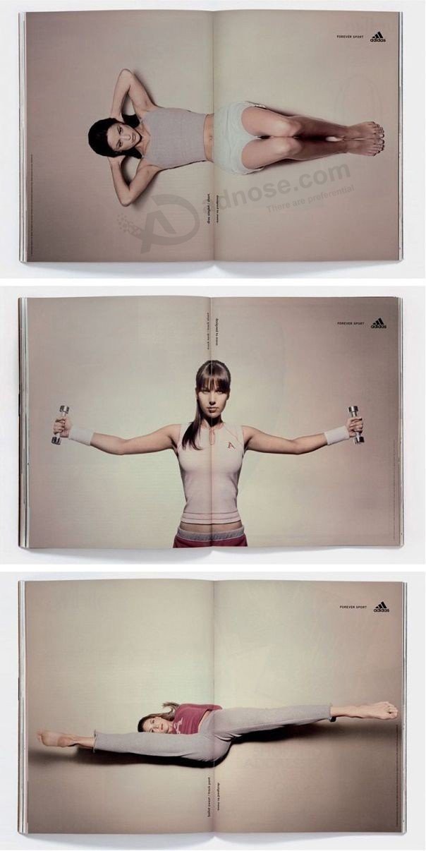
01. Use the fold
This double page spread for Adidas: Forever Sport uses the fold as part of its design. Open and close the pages and the athlete crunches, lift weights and stretches.
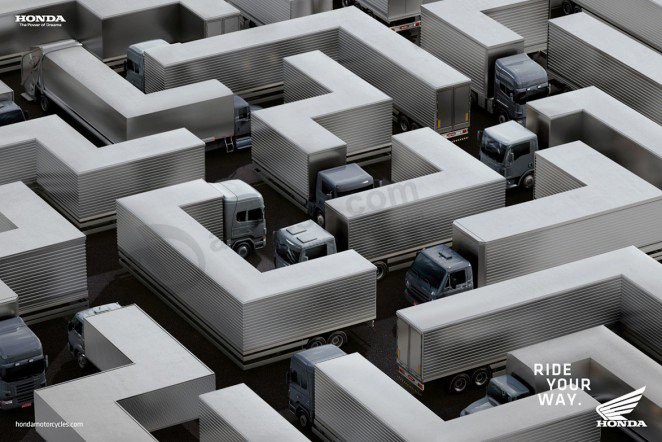
02. Make your audience look twice
Nobody likes bumper-to-bumper traffic – except perhaps motorcyclists who can dodge and weave through trucks, cars and buses like a maze. Honda Motorcycles captures this idea in a series of print ads that feature a variety of vehicles distorted and laid out like a maze.
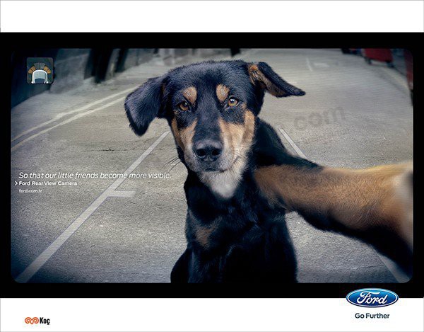
03. Use animals to send an important message
A dog taking a selfie? Not quite. This ad by Ogilvy Istanbul is for Ford’s Rear View Camera and it features a dog staring straight into the camera – in effect, straight out to the audience – to bring feeling and emotion to an important message.
04. Remind your audience of what other people live with
Alzheimer is a debilitating disease that causes disruptive memory loss and those living with Alzheimer need to be constantly reminded of things in order to get through the day. This print ad by Simone Mascagni plays on that repetition, promoting World Alzheimer’s Day and reminding audiences of the challenges of Alzheimer.

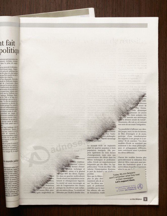
05. Play with the magazine format
This ad for Alzheimer’s Day by Publicis in Belgian also has a concept based on memory loss. Using the format of the magazine medium, the ad shows ink dissolving or being brushed away, much like the memory of those living with Alzheimer.
06. Make use of newspaper columns
Likewise, Ogilvy & Mather in Columbia used the columns of the classified ads to promote Carulla Knives. A series of ads show images of fish and vegetables sliced and diced between the columns in the newspaper.

07. Transform objects into parts of the body
Bike machinery becomes body machinery in this ad by Argentenian studio La Comunidad promoting the health benefits of cycling. Concept, design and consistency makes for an aesthetically appealing and easy to understand campaign.

08. Turn the brand name into an adjective
Claire Heppner turned the brand name of everyone’s favourite spread into an adjective and showed some of the ways Nutella becomes ‘nutellable.’

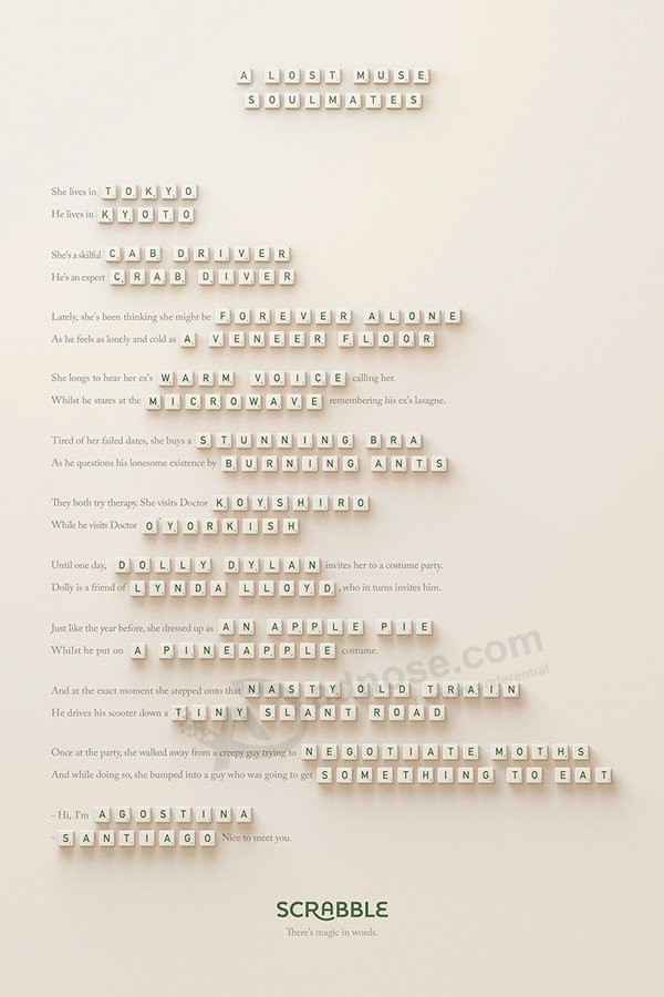
09. Use storytelling
Who doesn’t love a good story? Marketing agency Lola Madrid used anagrams in a series of ads for Scrabble to tell a love story for word lovers. Lola executive creative director Pancho Cassis told Adweek the primary goal was “to convey that words are magical and powerful, and that they connect us with people.”
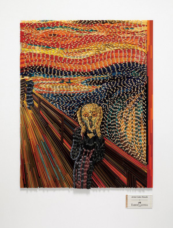
10. Reinterpret a famous image
To promote Faber-Castell’s range of “Artist Color Pencils” Ogilvy & Mather Singapore recreated famous paintings using thousands of color pencils – not to draw the paintings but as the actual medium. Look closely and you’ll see a sea of pencils meticulously planned and glued to reinterpret Edvard Munch’s “The Scream.”
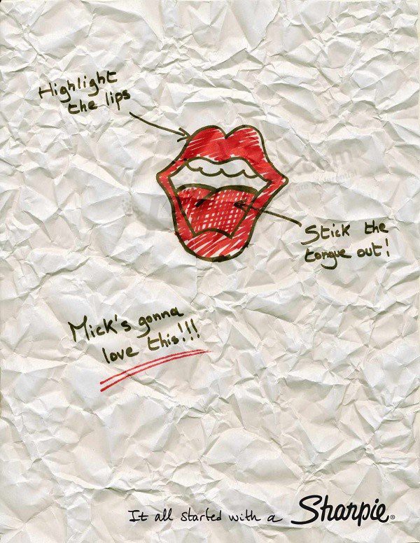
11. Have fun with famous logos
Designed by Miami Ad School, these Sharpie print ads have fun with well-known logos. With the tagline “It all started with a Sharpie,” the ads playfully show how the logos for The Rolling Stones, Apple and Playboy may have come about.
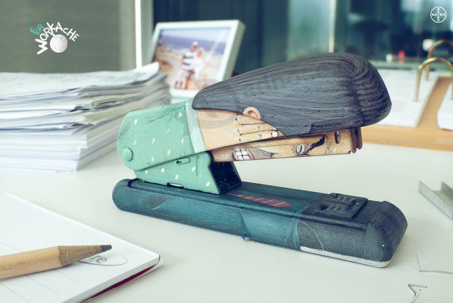
12. Depict a feeling people can relate to
This campaign called “Work Ache” for painkillers Aspirina Bayer features a stapler painted with a man face down holding the sides of his head. It cleverly depicts how a headache can feel like you’re hammering your head on the desk.
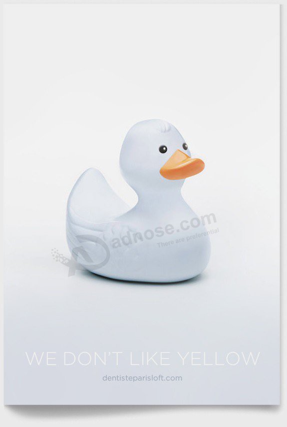
13. Make color part of your message
Pearly white teeth are one of the goals of oral hygiene and beauty and as such these print ads for a teeth-whitening office simply state, “We don’t like yellow.” It demonstrates this tagline by turning typically yellow objects – lemons, bananas, egg yolks and a yellow duckie – white because, as they say, “we don’t like yellow.”
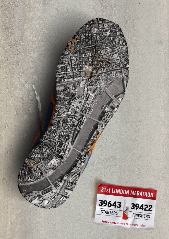
14. Be literal
This ad for the London Marathon by Reflex Spray has a shoe with a miniature re-creation of London on its sole. The shoe has literally run all over the city.
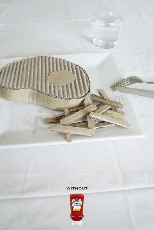
15. Appeal to people’s tastebuds
Heinz appeals to its audiences’ tastebuds in this ad for tomato ketchup. According to the ad, your steak and French fries are going to taste like cardboard without their world famous sauce.
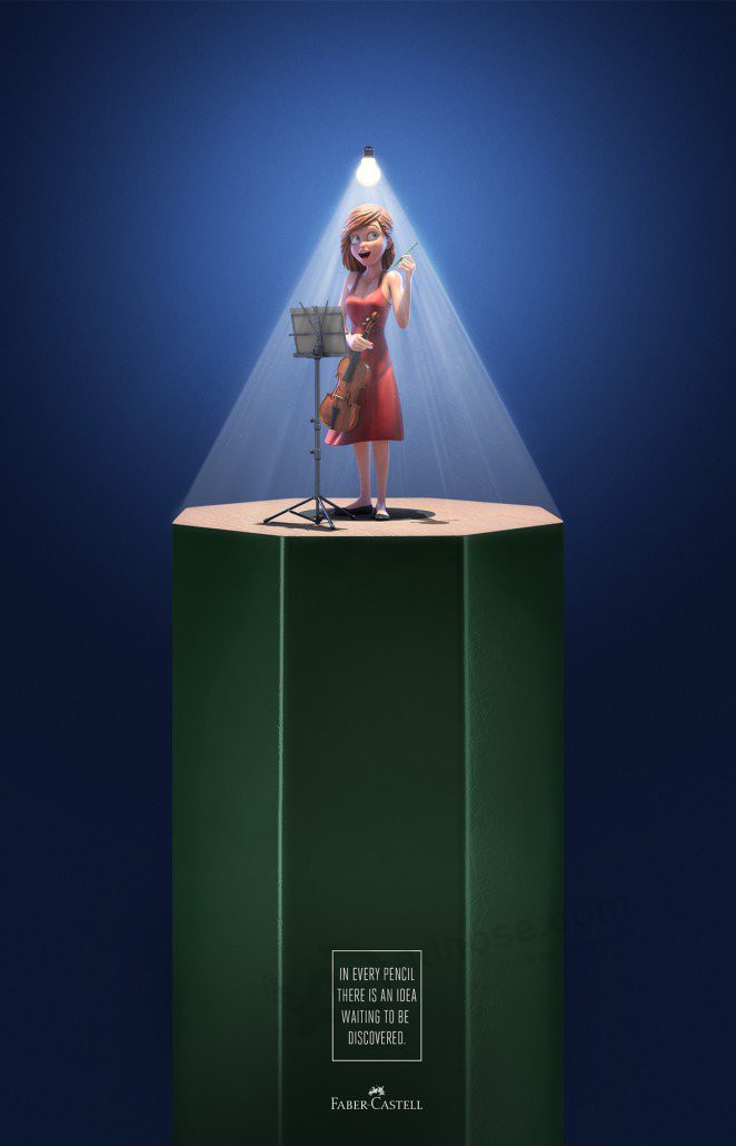
16. Depict inspiration
“In every pencil there is an idea waiting to be discovered” states this series of ads for Faber Castell. It turns the lead of the pencil into a spotlight to depict a musician, writer and scientist having their light bulb moment of realization or inspiration.
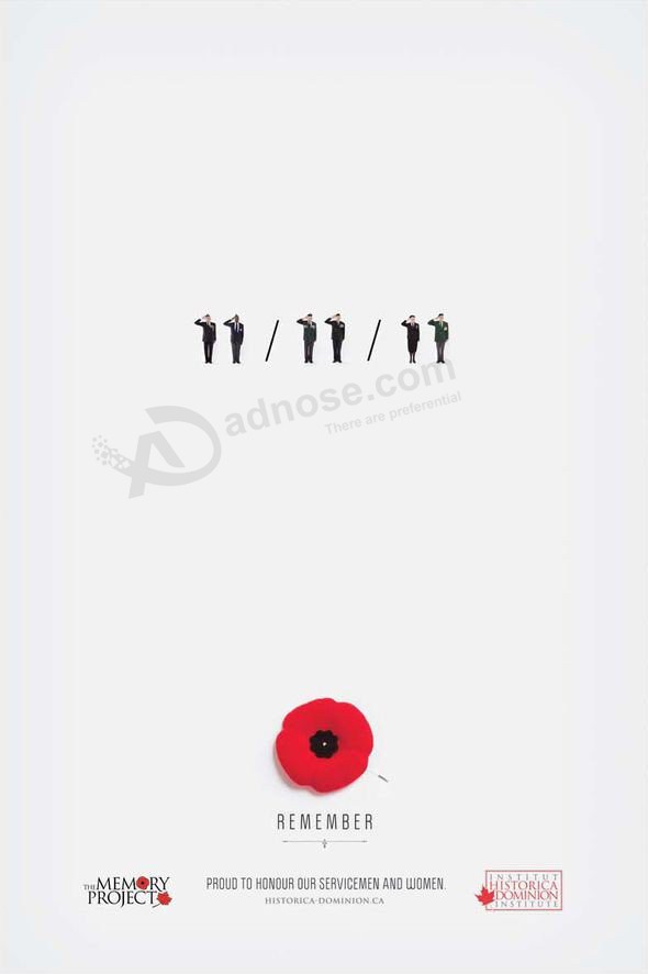
17. Act on a once-in-a-lifetime moment
For the momentous occasion when Remembrance Day fell on the 11th day of the 11th month of the 11th year, DDB Canada paid tribute to the serving men and women with this simple but highly effective ad. They created a visual representation of the historic 11/11/11 day with veterans to in place of the numbers.
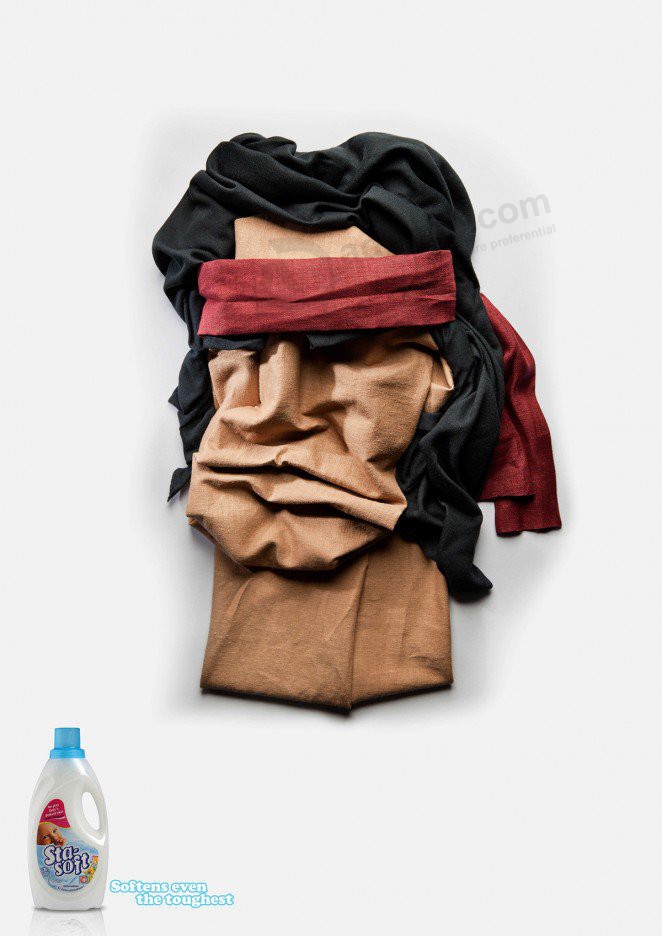
18. Use humour
This fun series of print ads for StaSoft by Ogilvy & Mather Johannesburg depicts tough guys Sylvester Stallone, Hulk Hogan and Chuck Norris as cloth caricatures. With the tagline “Softens even the toughest” the fabric portraits are humorous and above all engaging and memorable.
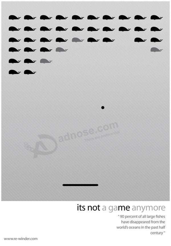
19. Be thought-provoking
Bulgarian designer Alexander Nedelev used retro game designs to highlight environmental gradation. He used the iconic designs of Space Invaders, Pac-Man and Arkanoid to represent diminishing numbers of whales, trees, plants and animal species. Cleverly, the tagline “It’s not a game anymore” uses grey and black text. The black text reading “It’s not me” is thought-provoking and possibly a commentary on a lack of responsibility or ability to affect to change.
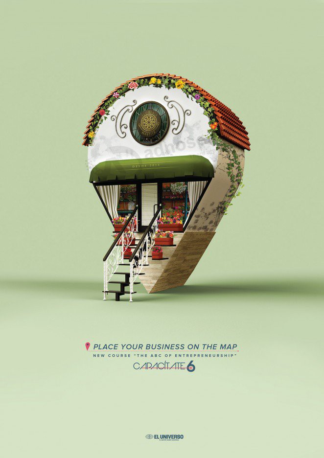
20. Transform a recognizable icon
These ads for Capacítate styles the recognizable ‘pin’ icon into a variety of businesses – a café, flower shop and restaurant. Promoting courses in entrepreneurship, it’s all about “plac[ing] your business on the map.”
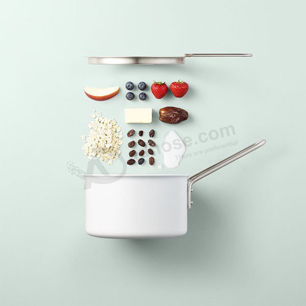
21. Show don’t tell
Photographer Mikkel Jul Hvilshøj meticulously laid out food and cooking utensils and equipment for Eva Solo. The series of ads showcase the cookware product and ingredients in minimalist visual recipes.
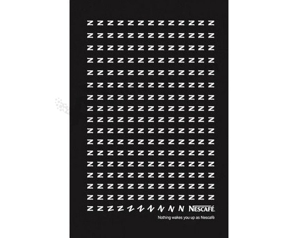
22. Give letters life
Ultimately, this ad for Nescafé is just a lot of zig-zags laid out in rows and columns on a page. However, with the tagline “Nothing wakes you up as Nescafé,” these zig-zags become Z’s – for sleeping – and they eventually ‘wake up’ and become N’s – for Nescafë.
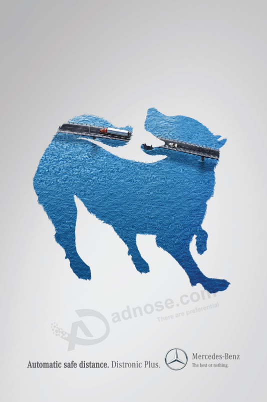
23. Use a visual metaphor
Ogilvy & Mather Columbia’s series of ads for Mercedes Benz’s Distronic Plus – an ‘automatic safe distance’ device – uses a series of images in which an animal or human is trying to connect two body parts. But look closer at the image and you’ll see the connection could prove to be deadly.
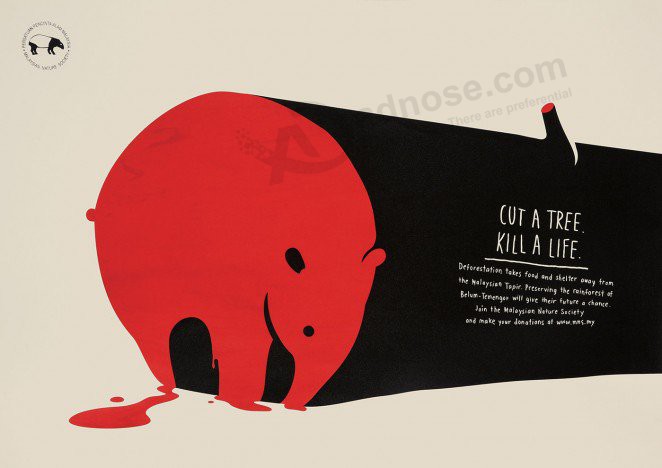
24. Use bold colors
“Cut a Tree. Kill a Life.” The tagline is to-the-point, the graphics are simple and the colors are bold in this series of print ads that draws attention to the devastating effects of deforestation. The trunks of chopped-down trees take the shape of endangered animals dripping in blood.
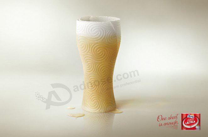
25. Exaggerate the product’s ability
This ad for Foxy Asso Ultra paper towels utilizes the product in an exaggerated display of its use in order to emphasize its ability to do the job.
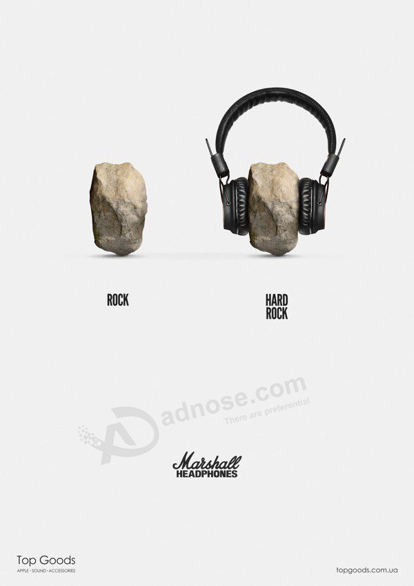
26. Play on words
Viktor Kolodiazhnyi is rocking it with this oh-so-simple concept for Marshall Headphones and oh-so-effective series of print ads. Taking a rock and a metal ball, he adds earphones and transforms them into ‘hard rock’ and ‘hard metal.’
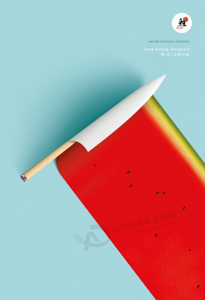
27. Arouse the taste buds
This minimalist ad for Japanese knives Miyabi looks good enough to eat. It’s clean, crisp and almost mouth watering – just like the watermelon it depicts.
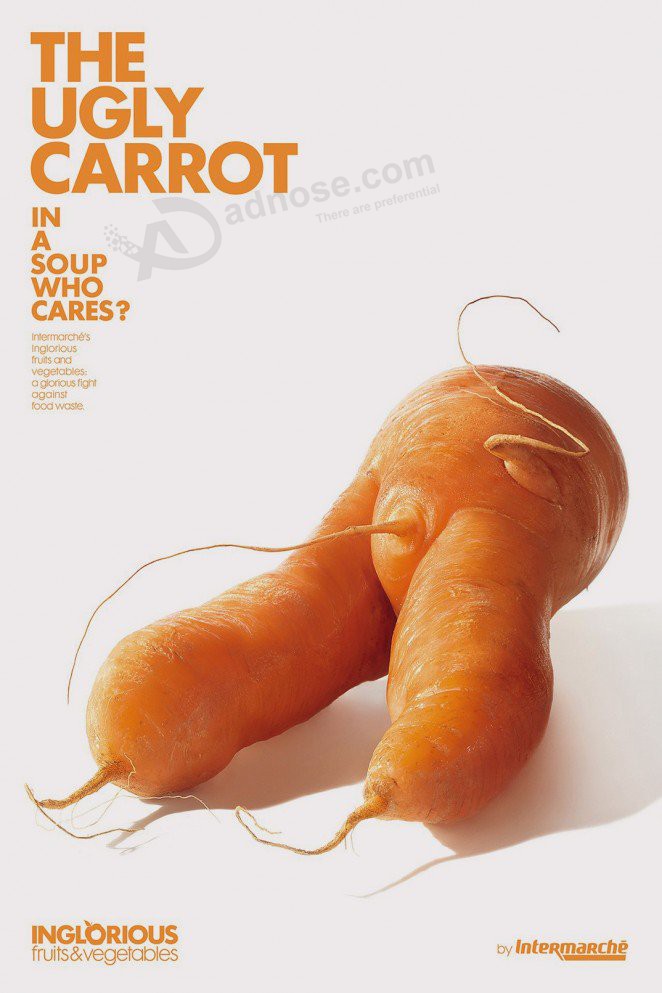
28. Draw attention to imperfections
Food advertisements typically feature perfect looking food – the ‘supermodels’ of food, so to speak. But what of the imperfect and flawed? Agency Marcel Paris created a beautiful series of print ads for French supermarket chain Intermarché that makes ‘differently-shaped’ fruit and vegetables attractive in order to bring attention to food waste.
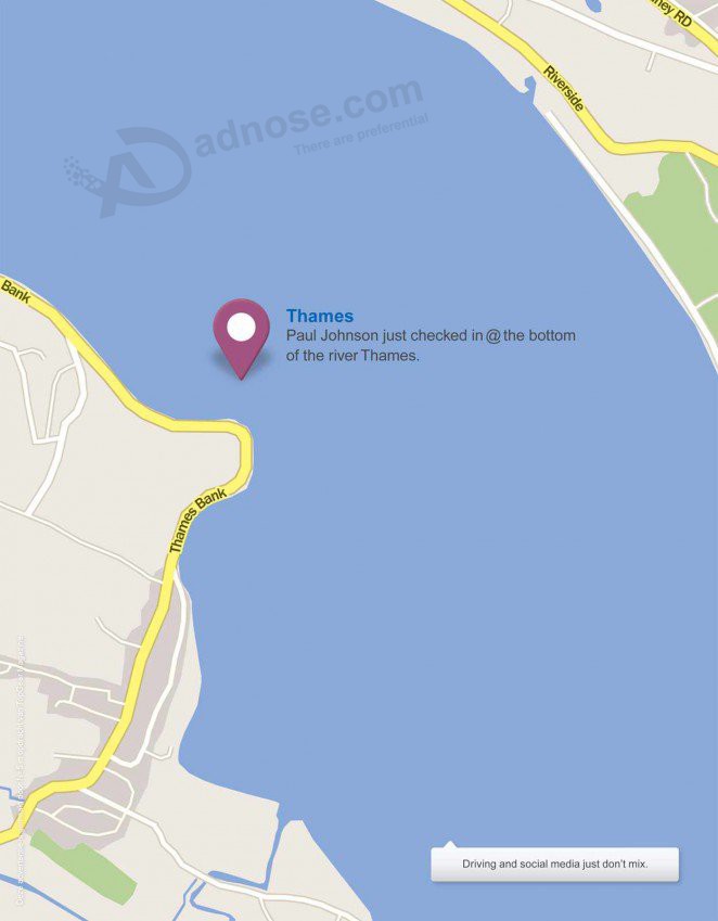
29. Highlight dangerous behaviour
This print advertisement for TopGear Magazine warns of the dangers of using social media while driving. It is a very simple concept that takes little interpretation with the tagline “Thames. Paul Johnson just checked in @ the bottom of the river Thames. Driving and social media just don’t mix.”
30. Amplify the product’s ingredients
A mountain of cheese might be to some people’s desire. For Pringles Galaxy, Chris Labrooy used 3D technology to transform a stack of cheese into, well, “Cheese with extra cheese and a side order of cheese.” Cheesy enough?

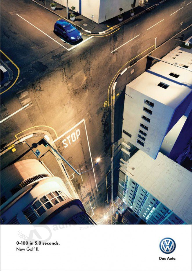
31. Trick the eye
This ad for VW Das Auto is a masterpiece of visual trickery. It appears three-dimensional on a two-dimensional surface, plays with perspective and tests physics.
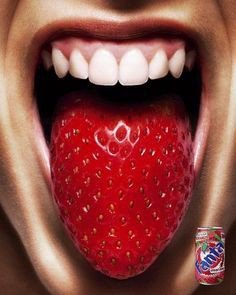
32. Go for an extreme close up
Fanta Strawberry will leave your tongue feeling like a strawberry according to this print advertisement. The extreme close-up is eye-catching and well executed.
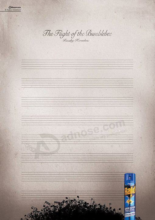
33. Be inspired by music
Inspired by Rimsky-Korsakov’s famous “The Flight of the Bumblebee,” Draft FCB created an ad that shows the power of Raid. With notes and musical symbols piled at the bottom of the page, Raid has, in effect, killed the bumblebee mid-flight.
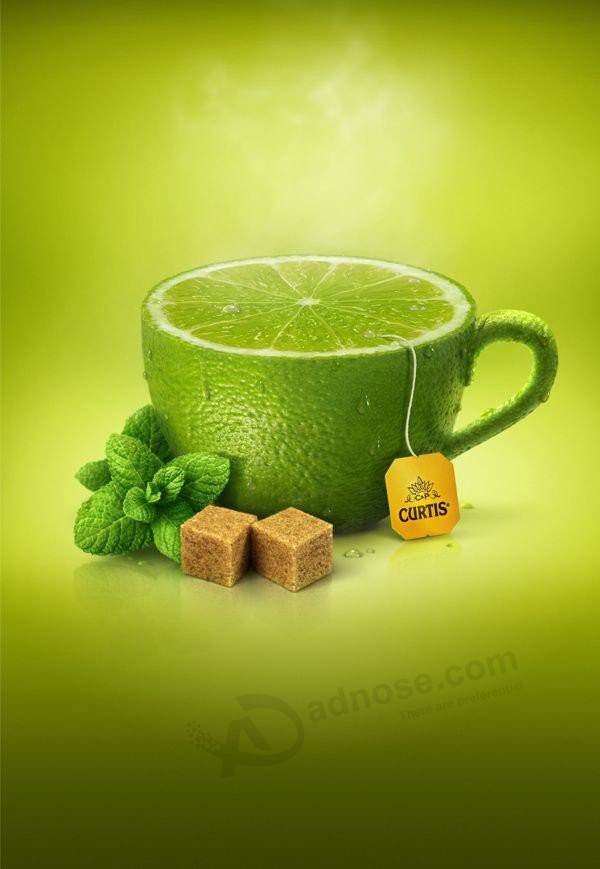
34. Create a sense of taste and aroma
Fruits have very recognizable smells and tastes that are refreshing and satiating. This ad for tea brand Curtis takes advantage of the sensation of smell and taste that can come with looking at a piece of fruit. Add a little steam and your mouth starts water.
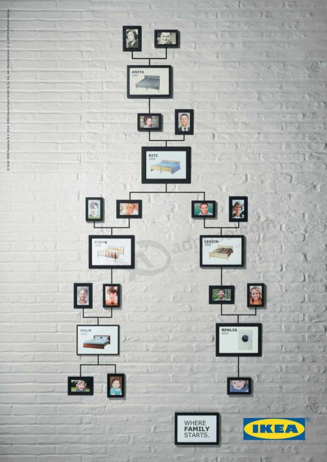
35. Unearth some fun facts
Here’s a fun fact: apparently 10 per cent of Europeans were conceived on Ikea beds. Ikea used that titbit of knowledge for this print campaign that inserts pictures of different Ikea beds in between generations of ancestors on a family tree. You’ll also find a washing machine, a kitchen sink and kitchen table in there because why keep things in the bedroom!
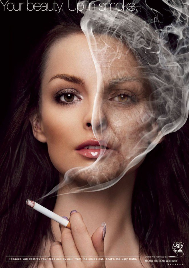
36. Make comparisons
This ad for World No Tobacco Day compares two sides of a woman’s face to demonstrate the ravaging effects of smoking. One side is young, fresh and bright; the other is aged, wrinkled and dull.
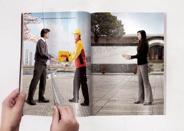
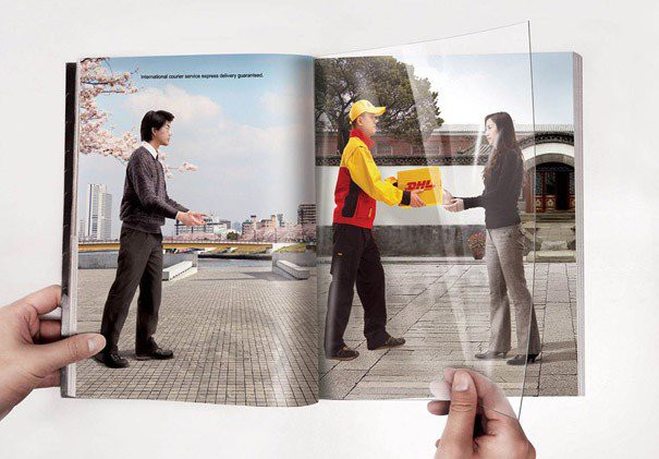
37. Create a sense of movement
Shanghai J&J Advertising cleverly uses a transparent page as part of this double page spread for DHL couriers. The courier moves from sender to receiver as you turn the page in order to demonstrate how fast DHL’s service is.
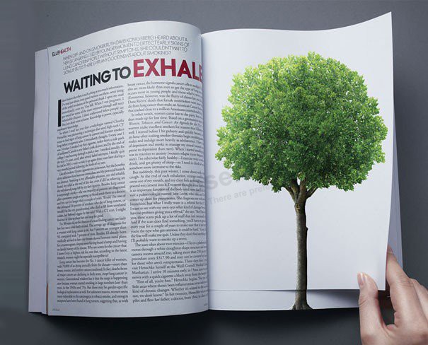
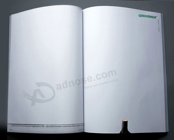
38. Create a sense of loss
Likewise, this double page spread for Greenpeace uses a smaller transitional page to show the effects of tree clearance. On one page you see a luscious tree in growth. Turn the page and only the stump remains.
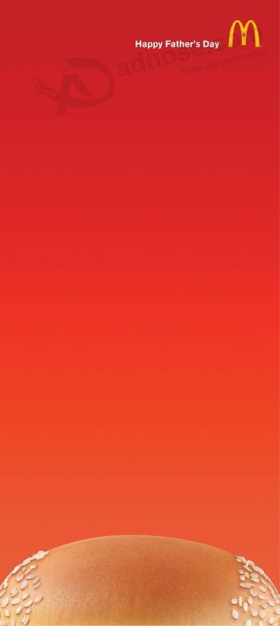
39. Play with perception
Is that a balding man’s head? Or the top of a hamburger bun? Well, it’s both in this McDonald’s ad for Father’s Day. The ad cleverly plays with perception emphasised but its elongated dimensions.
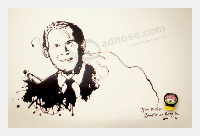
40. Acknowledge audience opinion
Not everyone loves marmite and not everyone loves George W. Bush (perhaps somewhat of an understatement). Marmite acknowledges audience opinion in this print ad, which aligns marmite with a portrait of Bush and the tagline “You either love it hate it.” True words.
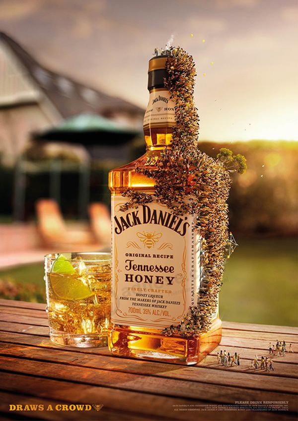
41. Connect the tagline and image
A little honey will draw a crowd of bees while a little JD’s will draw a crowd of people. Accordingly, the tagline “Draws a Crowd” for Jack Daniel’s Tennessee Honey is bang on the mark and visually represented by a bottle swarming with people.
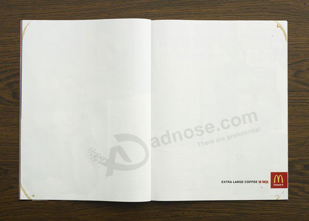
42. Take advantage of a white page
You need to look closely at this McDonald’s ad promoting extra large coffee. Coffee stains around the corners of the page make for a subtle and effective ad that really uses a white page to its advantage.
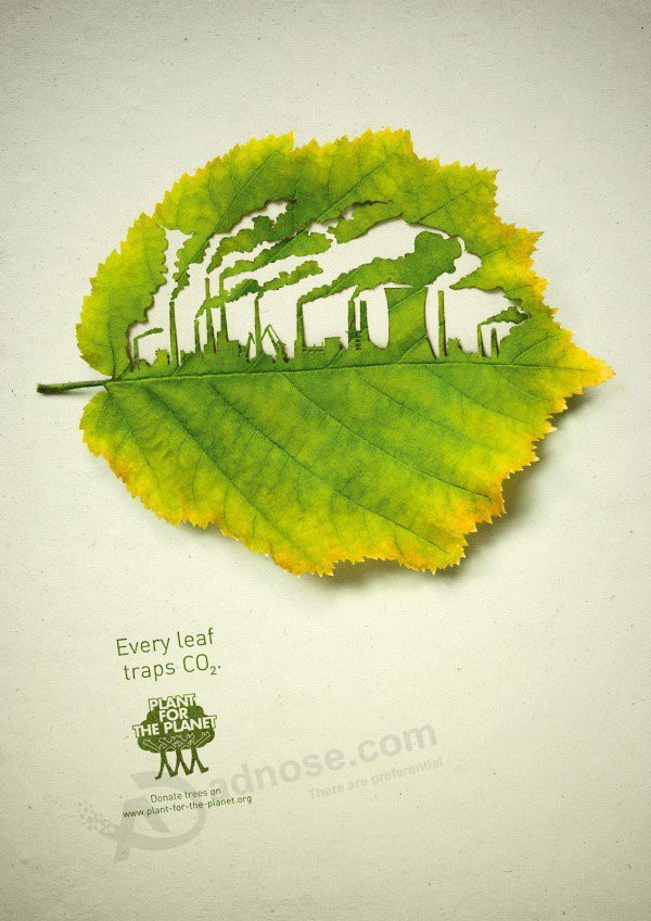
43. Look to nature for inspiration
Advertising agency Legas Delaney created this series of print ads for Plant for the Planet. Each features a leaf cut with an image of industry or transport to represent nature’s ability to trap CO2.
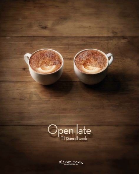
44. Create a mood
This ad for Oliver Brown uses relaxing imagery and colors to create a mood. Two cups of coffee have chocolate sprinkled in the shape of heavily tired eyes. And suitably so as Oliver Brown is “Open Late.”
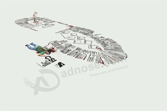
45. Appeal to fans
This print ad by Publicis appeals to tv show CSI’s huge fan base by tapping into the show’s investigative genre. A giant footprint is a maze of evidence that leads to a corpse.
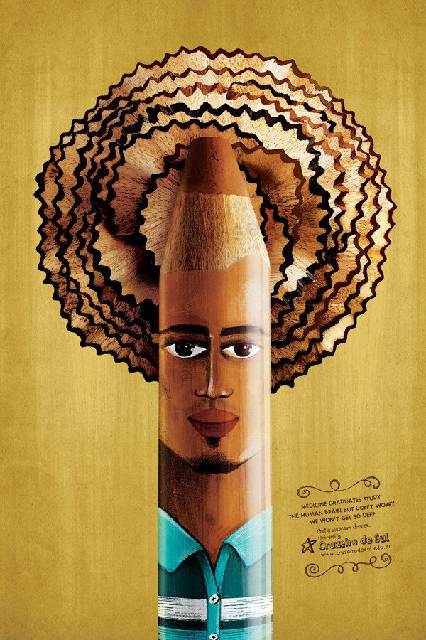
46. Animate inanimate objects
This series of ads by Juliano de Almeida use bright and playful images to promote University Cruzeiro do Sol. Pencils are animated with faces, clothing and jewellery and pencil shavings for hair.
47. Use optical illusions
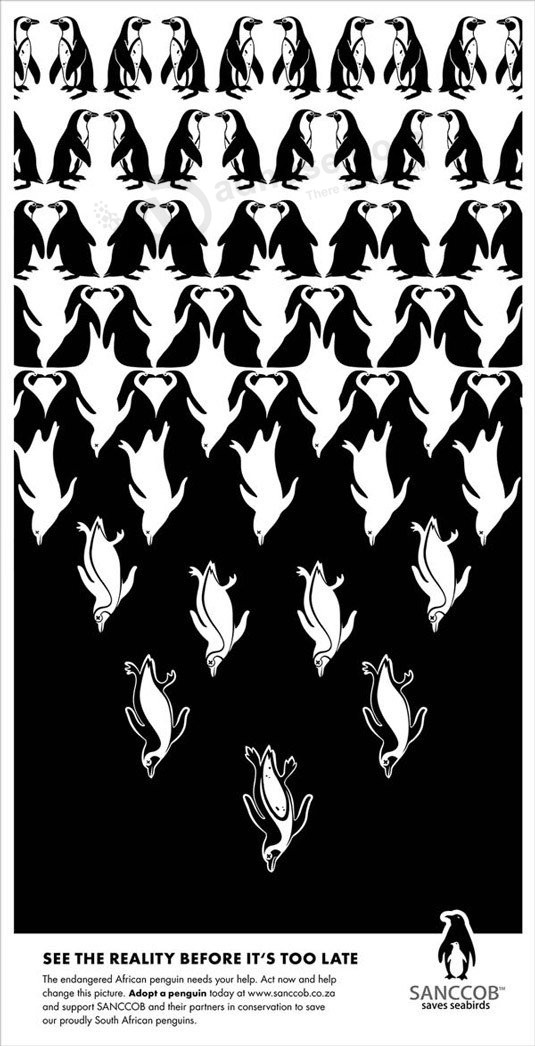
This ad for Sanccob draws attention to the rapid decline in African penguins and is inspired by the artwork of Dutch graphic artist M.C. Escher. Clever optical illusions are used to draw the viewer in and emphasize the message “See the reality before it’s too late.”
48. Contrast technology
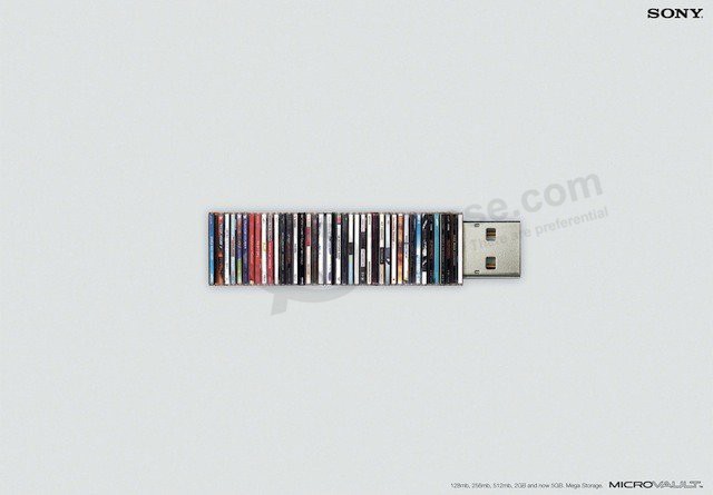
This Sony ad illustrates the capabilities of a USB drive by stacking CDs in place of the micro storage unit. It also cleverly demonstrates why and how new technology is making old technology obsolete.
49. Create an image with the product
Ariadne Colliard explored the origins of tea for this Tazo print campaign. Each tea bag features an image of architecture to represent the tealeaves’ origins.

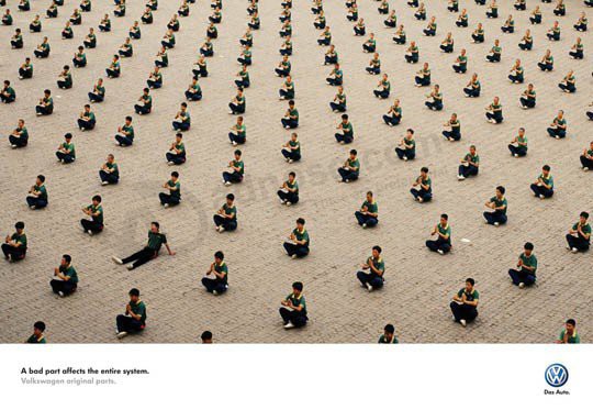
50. Break a pattern
Our eyes quickly become accustomed to looking at patterns and visual systems so when you break that pattern or system the unordered element will stand out like a sore thumb. Indeed, this is the simple and effective concept behind VW’s ad campaign, “A bad part affects the entire system.”